


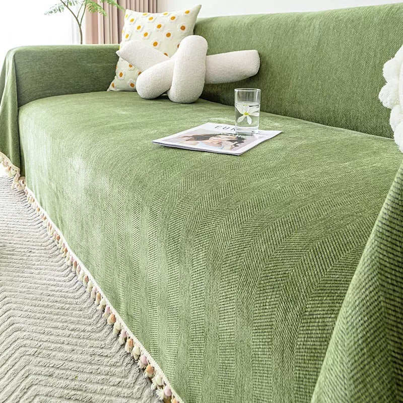


Tonal Sofa Styling: Build a Premium Look with Layered Texture

By Snug & Homely
A premium-looking sofa arrangement starts with colour relationships, proportion and a tidy fit. You do not need every surface to match exactly, but the cover, exposed upholstery and surrounding room should look as though they belong together. Tonal styling uses related colours and different textures to create that sense of intention without relying on a large number of accessories.
For an Australian living room, this can be a practical way to refresh a comfortable sofa before the summer hosting season. You can retain the furniture, work with the colours already in the room and choose a removable textile that suits everyday use. The result depends on thoughtful placement as much as the product you buy.
This guide explains how to build a tonal sofa arrangement with SoftBlend Luxe, HerriLoom and LuxeFit as three different product references. It focuses on the choices that make the finish feel considered: undertones, visible texture, coverage, fabric joins, light and care. Styling suggestions are editorial ideas, while product descriptions are kept separate from unsupported performance promises.

Understand what tonal styling means in your room
Tonal styling brings together colours that relate closely enough to feel connected, while allowing differences in depth, texture and finish. It does not require a sofa, cover, rug and curtains to be identical. In fact, exact matching can make a room feel flat when every surface reflects light in the same way.
Begin with the colours that are hardest to change. Your floor, large rug, curtains and major furniture pieces provide the setting for the cover. If the floor has warm brown or honey tones, notice how a sample image of the chosen cover sits beside them. If the room is mostly cool grey, consider whether you want to continue that direction or introduce a deliberate warmer layer.
Look at the original sofa too. Separate cover pieces may leave its sides, arms or back visible. Those exposed sections are part of the palette, not a mistake to ignore. Decide whether the new layer should sit close to the upholstery colour or contrast with it in a controlled way.
Keep the plan simple enough to describe in one sentence, such as “a soft neutral seat with a slightly deeper textured back”. That gives each piece a role. It also helps you avoid buying several unrelated colours because they looked appealing in separate product photographs.
Choose one colour family before choosing every piece
Select a main colour family, then consider lighter and deeper versions within it. Natural tones, greys, muted greens and other restrained colours can all support a tonal arrangement. There is no single premium palette; the important point is how the selected colours work with the room you already have.
Think about undertones rather than relying on labels such as beige or grey. A beige can lean pink, yellow or brown, and a grey can read warmer or cooler depending on light and surrounding colours. Product photographs provide a useful reference, but screen settings and room conditions can affect what you see.
Check the complete product image, not just a small colour swatch. A textured fabric can show highlights and shadows that make it appear more varied across a large surface. A herringbone pattern may read as texture at a distance and become more defined when viewed close up.
If colour matching is critical, ask what information is available before buying. Do not assume a photograph guarantees an exact match to your curtains or an older cover. A coordinated family of colours is often easier to live with than a plan that succeeds only if two textiles are indistinguishable.
Use texture to create interest without adding clutter
Texture gives a restrained palette depth. A woven-looking blend, a herringbone chenille and a broader plush drape can each change the way a sofa appears even when their colours are related. The aim is to let those differences contribute to the room without competing for attention.
SoftBlend Luxe is described as a cotton, polyester and viscose blend with a cotton-linen feel. That is a surface character to consider when you want a quieter visual layer. It should not be described as pure linen or treated as identical to a natural linen textile.
HerriLoom offers a chenille herringbone appearance with a non-slip design. Its visible pattern can provide more structured texture, particularly on larger uninterrupted areas. LuxeFit is described as high-density chenille with an elegant drape, providing another way to introduce textile depth.
You do not need to combine all three on one sofa. Use them as comparison points and decide which texture should dominate. A single well-chosen cover can provide enough interest. Adding several different fabrics simply because they are related in colour can make a small lounge feel busier than intended.
Decide where the eye should land
A considered arrangement has a focal area. On some sofas, that is the main seat and backrest. On others, the chaise or a distinctive arm becomes the visual anchor. Decide where you want attention to settle before spreading several layers across the furniture.
If the sofa itself has a strong shape, keep the cover arrangement simple enough to preserve that outline. A broad drape can soften the silhouette, while separate pieces can leave more of the original form visible. Neither approach is automatically more refined; choose the one that suits the furniture and your preferred appearance.
Use contrast carefully. A slightly deeper cover on a pale sofa can define the seating area, while a close tonal match can make the layer feel quieter. Strong contrast at every arm, cushion and backrest creates a different effect from a calm, connected arrangement.
Look at the sofa from the doorway, not only from directly in front. If the room is open plan, check the side and rear views too. A cover that looks tidy in a straight-on photograph may reveal an awkward edge from the path people actually use through the room.
Plan coverage and joins as part of the design
Separate pieces introduce visible boundaries. Those boundaries can look deliberate when they align with the sofa’s natural sections, but random overlaps can make the arrangement feel improvised. Measure and position each piece so the joins have a clear relationship to seats, arms and backrests.
HerriLoom’s individual-piece format illustrates why quantity matters. Its pieces are sold separately, allowing you to choose dimensions for each section. A photograph showing several covered surfaces does not mean one item supplies the entire arrangement. Plan the visible boundaries before selecting the required sizes.
SoftBlend Luxe likewise explains that the display is not a pre-selected complete set. Check its packing list and choose the pieces required for your intended appearance. LuxeFit’s broader draped approach still requires dimensions that suit the sofa, desired drop and exposed areas.
Use the sofa size guide to plan the format you select. Keep fabric clear of walking paths and any moving mechanisms. An arrangement looks more finished when it functions properly during normal use, rather than needing constant rearrangement to preserve a photograph.
Control the amount of drape
Drape changes both appearance and practicality. A generous fall can make a sofa feel relaxed and enveloping, while a shorter, more defined placement can preserve the furniture’s lines. Choose the amount intentionally rather than assuming the largest available textile creates the most luxurious result.
Too much fabric can bunch on the seat or collect near the floor. Too little can expose an unwanted strip of upholstery or pull away when someone sits down. The right balance depends on the sofa shape, product format and the way the cover is meant to be placed.
Use an existing clean sheet to visualise the proposed drop if you are unsure. This will not reproduce a product’s texture or backing, but it can show where the edges would sit. Photograph the trial from normal viewing angles and note any area where the coverage should change.
On a chaise or modular lounge, consider separate sections if one large drape creates awkward tension at the corner. The visible joins become part of the design, so align them thoughtfully. A practical arrangement that stays usable is more convincing than a continuous layer that cannot sit comfortably on the furniture.
Style around the original upholstery
When parts of the original sofa remain visible, treat them as a deliberate material in the room. A textured seat layer on a smooth upholstered frame can create useful contrast. A cover close to the original colour can soften that contrast while still changing the contact surface.
If the upholstery has a strong pattern, decide whether you want it visible. A plain or quieter cover may work well across the seats, but the remaining patterned arms and backs will still influence the room. Broader coverage may be needed if your aim is a more complete change.
Do not attempt to disguise a serious fit issue with many decorative cushions. First establish adequate coverage, correct orientation and a usable seat. Accessories should finish the arrangement, not hide a cover that is too small or positioned against its intended format.
Keep the original sofa’s care requirements in mind. Backings and textiles should be compatible with its finish, particularly for leather or delicate coatings. A non-slip description does not establish universal compatibility. Ask for relevant guidance when the interaction between the cover and upholstery is important to your decision.
Let accessories support the cover
Once the cover is in place, begin with the accessories you already own. Choose a small number that repeat a colour or texture from the main arrangement. Leave enough of the new surface visible to appreciate the fabric you selected.
If the cover has a herringbone pattern, you may prefer quieter accessories nearby so the woven character remains clear. If the cover is visually simple, an existing patterned cushion can provide a focal accent. The aim is balance, not a rule that every item must be plain or every texture must be different.
Keep practical seating space available. A sofa that requires several cushions to be moved before anyone can sit down may look styled but feel inconvenient. Consider how the arrangement behaves on an ordinary evening, especially in a family lounge used by several people.
Photographs often include cushions, furniture and other styling elements that are not supplied with the cover. Read the selected product’s package contents rather than assuming you are buying the complete scene. Budget for the cover arrangement you need and assess additional accessories only after it is in place.
Check the look in different light
View the room in daylight and under the lamps you use in the evening. Related colours can appear more or less similar as light changes. Textured surfaces can also show different highlights depending on the direction of the light and the way the fabric is laid.
Avoid making the entire decision from a brightly lit product image on a phone. Compare several views and consider the actual light in your lounge. If the room is dim, a subtle tonal difference may disappear; if it receives strong side light, texture may become more pronounced.
Use a simple photograph of your room to compare the overall balance, but remember that a camera can alter colour too. The photograph is helpful for proportion and arrangement. It should not be treated as a precise colour-measurement tool or proof of how a product will look after delivery.
Manage direct sunlight according to the room and sofa’s care requirements. The covers in this guide are not being presented as certified UV barriers. A visual summer refresh does not remove the need for appropriate blinds, curtains or other measures where strong sunlight affects furnishings.
Keep the premium look practical to maintain
A tidy appearance depends on care you can actually follow. SoftBlend Luxe specifies water under 30°C, neutral detergent, gentle treatment and air drying. It also advises against high temperatures, prolonged soaking and bristle brushes. Review those details before deciding that its surface is the right choice for your home.
LuxeFit is described as machine washable. HerriLoom’s current product information should be checked for the care details relevant to the selected item. Do not copy one product’s routine onto another simply because both are chenille or appear in the same colour family.
Think about the marks your household produces. A light cover may show some everyday marks, while a dark cover can make pale pet hair more noticeable. A texture can add visual depth, but it does not make dirt disappear or establish stain-proof performance.
Plan a manageable reset: straighten pieces when tidying, remove loose debris with an appropriate method and wash according to the label when needed. A considered arrangement should be comfortable enough to use and simple enough to restore without turning routine living into a styling exercise.
Compare the complete arrangement before buying
Make a list of the pieces required for each shortlisted approach. A separate-piece herringbone arrangement and a broad chenille drape may involve different quantities and costs. Compare the price of achieving your intended result rather than the smallest starting price in each product range.
The current automatic multi-buy structure lists 5% off two or three eligible sofa-cover items and 10% off four or more. Check eligible items and the applied offer in the cart. Buy extra pieces only when they improve the planned coverage or provide a useful spare.
If your budget is limited, begin with the main visual area and keep the rest of the room simple. A carefully chosen seat or back layer can be enough when the original upholstery is attractive. A larger purchase is useful only when it creates a result you want and can maintain.
Compare the sofa-cover collection with your measurements and colour plan beside you. For a broader checklist of purchase details, the existing sofa-cover buying guide can help you review fit, fabric and practical needs before ordering.
Use a final room check before committing
Reduce the plan to its essentials: one main colour family, one dominant texture and the coverage required for your sofa. Then check whether every selected piece supports that plan. If an item introduces an unrelated colour or an unnecessary overlap, reconsider its role.
Imagine the room after the sofa has been used for an evening. Can the covers be straightened easily? Are the edges clear of the floor? Can everyone sit comfortably without removing decorative layers? These questions reveal whether the arrangement is suitable for real life as well as appearance.
Check current availability for every required size and colour. If exact matching matters, do not assume missing pieces can be added later in an identical shade. At the same time, avoid buying unnecessary duplicates simply because future stock is uncertain.
Finally, confirm package contents, care and the selected-variant total. A premium impression comes from a clear, coherent choice. It does not require the largest basket, an impressive product name or a room filled with new accessories.
Keep a reference for the finished look
Once the plan is settled, save a photograph of the room and a short note describing the main colour family, dominant texture and intended coverage. This helps you keep future purchases consistent without expecting every accessory to match exactly. It also makes it easier to decide whether a later addition improves the arrangement or simply introduces another unrelated element.
After the cover has been used for a while, assess the room again in ordinary conditions. You may find that the original furniture and a single textile change already create the result you wanted. If something still feels unresolved, identify the specific issue—such as an exposed colour or an awkward overlap—before adding more layers. A useful reference supports a clear decision instead of turning a simple refresh into an endless shopping list.
Compare current product options
Open each product to check current sizes, selected-variant prices, availability and care instructions. Choose the dimensions you need before adding to cart.

SoftBlend Luxe Sofa Cover
A cotton, polyester and viscose blend with a cotton-linen feel. The listing specifies water under 30°C, gentle washing and air drying. One selected cover is supplied.

HerriLoom Chenille Herringbone Non-Slip Sofa Cover
Chenille herringbone texture with a non-slip design. Individual pieces let you build a measured arrangement; check each required size and the current care information.

LuxeFit – Universal High-Density Chenille Sofa Cover
High-density chenille with a draped finish and machine-washable description. Compare the selected dimensions with your sofa; universal wording does not guarantee fit.
Frequently asked questions
Do tonal sofa covers all need to be the same colour?
No. Tonal styling uses related colours with intentional differences in depth and texture. The key is that the selected pieces work with one another and the room. Exact matching is optional and can be difficult across different products, screens, lighting conditions and textile batches.
Which of these products looks the most premium?
There is no objective winner based on the product descriptions alone. SoftBlend Luxe offers a quieter blended-fabric approach, HerriLoom a herringbone chenille appearance and LuxeFit a high-density chenille drape. The most considered result depends on the room, correct coverage, proportion and the look you prefer.
Is SoftBlend Luxe a linen sofa cover?
Its listing describes cotton, polyester and viscose with a cotton-linen feel. It should not be presented as pure linen. Check the current composition if fibre content is important to your choice, and distinguish a fabric’s visual or tactile description from its actual material specification.
Can I mix separate pieces with a larger drape?
You can consider that arrangement if the pieces have clear roles and work comfortably together. Check for excessive layering, movement and awkward joins. A small removable seat layer over a broader drape may be practical in some homes, but it should be planned rather than used to hide an unresolved fit issue.
Will a non-slip cover stay perfectly neat all day?
A non-slip design can help reduce movement, but results depend on upholstery, fit, placement and use. It is not a guarantee that a cover never shifts. Choose suitable dimensions, follow placement guidance and expect to assess how the arrangement behaves in your own household.
How many accessories should I add?
Use as few as needed to support the arrangement and keep the sofa comfortable. Begin with what you already own, repeat a colour or texture deliberately and leave the main cover visible. A room can look considered with a simple arrangement that is easy to use every day.
Choose coherence over extra layers
Tonal sofa styling works when the colour family, texture and coverage tell the same story. Choose a product that suits your sofa, let its surface do useful visual work and keep the surrounding arrangement simple enough to maintain.
Review the product options below and compare their actual dimensions and care requirements. A measured, practical arrangement can bring a more finished look to your living room while keeping the sofa comfortable for everyday use.
A Second Sofa Cover Set for Summer: Plan a Practical Wash-Day Rotation
Cotton Gauze vs Chenille Sofa Covers: Florence Bloom and LuxeFit
Continue reading

LuxeFit vs MuMold vs Velvet Era: Compare Three Chenille Sofa Covers

Reversible Sofa Cover or Separate Chenille Pieces? Sucre Compared

Floral vs Geometric Sofa Covers: Persian Floral and Jacquard Compared

Cotton Gauze vs Chenille Sofa Covers: Florence Bloom and LuxeFit

A Second Sofa Cover Set for Summer: Plan a Practical Wash-Day Rotation

Need a Sofa Cover Soon? Check Fit, Stock and Delivery Before You Buy
